Thursday, November 29, 2012

Evolution of a Photographer

I've been gone for a while now. I don't know why I kept this blog around, with all of its eight entries (well, okay, nine including this one), but I did. Perhaps I had the notion that at some point, when I am ready and am further along my journey with photography that it would be waiting for me, ready to pick up where we left off.

I've also taken a rather extended hiatus from my first blog, Exploring Food My Way. I think that the insane amount of time and energy I put into keeping that blog live and vibrant at some point got transferred to my love of photography and learning the craft instead. So while my output on my food blog has dwindled to nearly nothing, my efforts at building a portfolio on my Flickr page have become almost daily postings, mostly of the foods that I eat during the day as well as special projects both for myself and others.

After re-reading some of my original posts, I have to almost laugh at my naivete. A year and a half doesn't seem like very long, but I have learned so much in that amount of time about the art and science of photography that I sometimes still amaze myself. I've had some wonderful teachers and mentors along the way, I've done a ton of self-study, and of course, the biggest help has been practicing with my camera. Learning how to be self-critical (good and bad) of my own work has been the biggest help in teaching me what works and what doesn't. That's not to say I am even close to the end of my journey -- I'm just farther along than I was in March 2011.

Oh, sure, I can say that I've improved, but how do you know?

Here is a sample image I published eighteen months ago:

(click to enlarge to full size)

So what is wrong with this picture? Oh, let me count the ways for you.

1) It's underexposed.
2) It's a bit grainy.
3) It lacks critical focus.
4) I've cut off both sides of the bowl (minor).
5) Busy background.
6) Brightest part of the image is in the background, distracting the eye from the foreground.

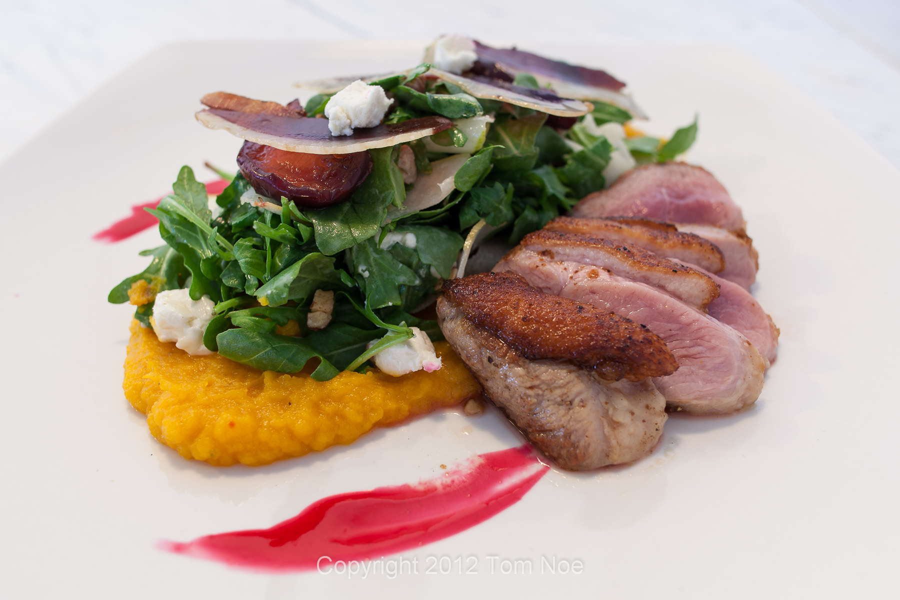
Here is an image I took a little more recently:

(click to enlarge to full size)

It doesn't take a well-trained eye to see a major difference between the two images. Which would you rather eat? Now, I'll be the first to admit that the two images were taken with completely different cameras. That being said, were I to set my current camera, a Canon DSLR, on fully automatic mode and take a picture, the result would very much resemble the first photograph in terms of underexposure and critical focus.

My goal is to write once a week, offering tips, observations, and a few of my photographs for consumption. I hope you enjoy what I have to say.

Friday, March 4, 2011

Gray Card, Why Do You Mock Me?!?

There are three variables every camera must determine when taking a picture. In fully automatic mode, the camera chooses all three. You, as the photographer, also have the option of controlling one, two, or all three of these values, too. These three variables are the shutter speed, the lens aperture, and the light sensitivity (aka ISO) of the sensor.

Being the control freak that I am, I quickly made the change from shooting in fully automatic to fully manual. My rationale was that if I let the camera make the choices and it chooses poorly, then there is little I can learn from to get better the next time. If *I* make all of the choices and take a poor picture, then at least I can learn from my mistakes and strive to do better next time.

There are hard and fast rules one must understand when setting these variables yourself, but fortunately they are simple ones, too. Every time you double the shutter speed, it doubles the amount of light that reaches the sensor at the back of the camera. Similarly, every time you double the ISO value, the sensitivity also doubles. And, yes, you guessed it, every time you go up one f/stop (the aperture is measured in f/stops), this also doubles the amount of light. So you can see, by creatively doubling one variable and halving another, you can effectively control what kind of picture you will have.

Somewhere along the line, someone with way too much time on their hands decided to analyze thousands (if not probably more) of photographs to determine what the average light reflectivity was in each photo. After what I'm sure was a mind-numbing effort, it was determined that the average light reflectivity was 18%. This meant that of all the light that struck the subjects in the photographs, only 18% of that light was reflected off of them and into the camera. Thus, the light meters built into all cameras from that point forward were set up to expect that every exposure would contain 18% reflected light.

In a perfect world, this would be great. But, as I'm sure everyone out there knows, we do not live in a perfect world. If I were to send back all of the food that didn't meter a perfect 18%, I would be a very hungry food blogger. Fortunately, a relatively easy solution exists to help out with this problem. Most (if not all) camera stores carry what are called "Gray Cards" which is a large cardboard (usually) rectangle that ... wait for it ... reflects exactly 18% of the light that strikes it. The theory goes that if you position the card where your photographic subject will be, fill the LCD screen with the gray card by zooming in, and adjust the three variables until your exposure meter reads "0", you should have a proper exposure. Now the only step left is to remove the gray card and snap the photo at the preset exposure levels and et voila! A perfectly exposed picture.

Hmmm ... don't believe the hype. At lunch today I decided to try this out before my first course arrived at my table. I leaned the gray card against my glass of water and after setting the ISO to 100 and the aperture to f/2.8, I adjusted the shutter speed until the exposure meter marker sat exactly at zero. According to the exposure meter, the correct shutter speed was two full seconds. Okay, a little long given the light levels where I was sitting, but hey, this is SCIENCE(tm)! It is accurate and repeatable! Additionally, the live histogram on the LCD panel had a spike right in the dead center, just as it should.

When my soup arrived, I removed the gray card and placed the cup of soup exactly where my water had been on the table. Here was the shot my camera took:


ACK!! Clearly this looked overexposed on the LCD panel and when I checked the histrogram in picture review mode, my suspicions were easily confirmed. The graph was heavily bunched up on the right side of the graph and spiked up to the top.

Scratching my head, I decided to start reducing the shutter speed until I got a good histogram reading (where it was evenly spread from dark to light) and took another shot, this time with the shutter speed being at four-tenths of a second:


Hey, look a that! It's actually a cup of soup, not the light from the nuclear bomb that just detonated outside the window! I would expect that at the first exposure setting, there might be a tick up or down on the actual shutter speed, but at ONE-FIFTH the original setting ... either I'm doing something horribly wrong or all this gray card metering before taking a "proper" exposure is just bullshit. Strong words, I know.

Honestly, the entire reason for going through this step makes sense to my science addled brain, but with results like this? Well, I clearly hope that I have just made a mistake in the process i used to utilize the gray card.

If anyone out there has any ideas of why this failed so spectacularly, I am open to any and all suggestions. For now, I'm going to continue to base my exposure settings on the live histogram on the back of my camera. While it isn't foolproof, it also has produced the most consistent results to date.

Thursday, January 27, 2011

The Curious Case Of The Blown Out Chicken

So after all that work to educate myself on using the live histogram on the LCD panel on the back of my G12, apparently there are exceptions to every rule. If you read my previous post, you will know that the G12 offers three different tools to help you decide whether or not the photograph you are about to take is properly exposed. First would be the LCD panel itself. While using the panel to compose the picture works beautifully, I've discovered that the image that appears on the panel looks way brighter than when I look at it on the computer in GIMP. Panel out.

The second method to judge the correctness of the exposure that I use in Manual mode is the exposure value indicator. This is a scale that runs from -2 stops to +2 stops and has a little marker that moves up and down and you change the exposure options. Until I discovered the power of the histogram, I would routinely adjust the shutter speed until the little marker landed on zero. I assumed this meant I had a properly exposed photo. In good light? Yes. In poor light? Absolutely not.

Through the suggestion of some on-line friends, I discovered the third, and best option, the histogram. Essentially a graph of all light in the photograph from dark to light, I noted that as I lengthened the shutter speed to let in more light, I would systematically drive the graph to the right. I would essentially do this until I had a nice even spread across the entire range. Suddenly, my low light photos started looking really good. I still had to adjust them in post processing, but only a little bit instead of huge swaths of lightening.

So imagine my surprise when I took a picture of my Thai Market Salad at Market Gourmet at Montrose (check out the food blog if you want more info) and when I got around to actually examining the photo on my netbook, I discovered something a little bit disconcerting:


This is generally a good photo. What surprised me was how blown out some of the sides of the chicken cubes looked. Okay, let's check the histogram:


A nice distribution to be sure, but I haven't even pushed the graph all the way to the right. I tried applying a High Pass filter to sharpen up the photo thinking that might bring out some of the detail and while it did improve the photograph overall, the detail still remained hidden. I even tried darkening the photo a bit, but that was a bust, too.

In an effort to understand, I returned the very next day (today, in fact) and decided to not only order the exact same salad again, but fortunately, the exact same table next to the window was available from yesterday's lunch. In fact, after setting the ISO to 100 and the f/stop to 8.0, the shutter speed for the first exposure was set to 1/3 of a second, just like the exposure I took the day before. Of course, the salad looked slightly different, but that's okay. I took four sets of exposures, driven at first by the histogram and then gradually backed down in order to hopefully expose more of the detail with an underexposed photograph.

The first set of exposures, I pushed the histogram. And it showed in the resulting pictures. They were too exposed. The second set were better:


Here was the histogram for this picture:


A nice distribution. Maybe pushing it a bit on the right hand side. The photo reveals definite loss of detail on the cut chicken pieces.

Fine. Dial down the shutter speed slightly. Here was what resulted:


More detail on the chicken, slightly darker exposure. Here's the histogram:


Now we're just barely hitting the right edge of the histogram. But things look better. Note that the exposure value indicator was just above the "0" mark for this one. Of the three, I think this one was the best compromise between driving the exposure using the histogram and what I saw on the screen.

Just for extra options, I shortened the shutter speed one more notch and took another photo:


This one came in right at "0" at the exposure value indicator, which is where I used to shoot at. I would've considered this a "proper exposure" about two months ago, but now I know to push it a bit on the G12. Here is the histogram for this photo:


Looking at the histogram, it looks fairly underexposed (you should know that I'm adjusting the shutter speed 1/3 of a stop at a time, so there isn't a dramatic difference in the resulting photographs). While there is the most amount of detail in the chicken, the rest of the photograph looks too dark.

In the end, I would probably end up going with the second photograph that I took today as the "hero" shot. Even though the histogram indicated that I could've pushed it farther to the right, real world examination of the photograph dictated that it was a good balance between proper exposure and overexposure.

For the purposes of disclosure, the first day I shot simply with a UV filter. The second day, thinking that polarized light might be an issue, I used both my UV filter and my polarized light filter, which did help the images out, in fact. All images, on both days, were shot on a tripod with an ISO of 100, f/stop of 8.0, and varying lengths of shutter speed. Each image was "sharpened" using a high pass filter with a value of 10 ... just to keep it all equal.

I guess the moral to the story is that rules are great, until they need to be broken. A rule that seems to be particularly valuable is to take your exposures at multiple shutter speeds. The brightest one (based on the histogram) might not be the best one.

Friday, January 7, 2011

Using The Histogram To Get Great Photos

Having a camera that gives you total control over the final exposure can be the best and worst thing possible. Obviously having total control allows you to control every single aspect of lighting, framing, and ultimately how the exposure will turn out. The downside is that without the proper training and education on how to use all of the tools at your disposal, pictures, especially like those I take all the time of food in poorly lit restaurants, can come out underexposed and flat.

When shooting in manual mode on my G12, there are two different tools at your disposal for judging whether the picture will be properly exposed. As soon as the camera is set in manual mode, a graduated vertical meter appears on the right hand side of the LCD display. The numbers range from -2 to +2 in 1/3 increments. As you adjust the ISO, shutter speed, and aperture, an indicator moves up and down the scale indicating the exposure value (or level) that the camera "sees."

In a well lit scenario, when the indicator hits the "0" mark, I have found that the resulting image is nicely exposed. However, as has been pointed out to me now by several people (and an on-line photography forum), in poorly lit scenarios, my pictures would come out woefully underexposed. The fact that the LCD display on my camera tends to display the pictures brighter than they appear on my laptop also adds to this illusion that I've captured a good photo.

My first reaction was to simply start adjusting the cameras settings so that I was shooting at "+1" instead of "0". However, this STILL resulted in me having to artificially lighten the photos in GIMP. Frustrated, I turned to the other tool at my disposal, the histrogram. A histogram is a graph whose x-axis represents all colors of light from black to white. The y-axis represents the intensity of that color in the photograph. While the LCD display on my camera displays both the exposure level and the histogram, until just a few days ago, I had only been looking at the histogram as a novelty. No more.

One of the pieces of advice I received when submitting my photographs to the Internet forums was to lighten the photo by pushing the histogram as far to the right as I could. While I didn't initially understand what this meant, it wasn't until I got into a situation where I could practice using the histogram that I finally understood what this meant.

I had lunch in the bar area of a local Fairlawn restaurant recently and I purposely asked to be sat in the corner booth, arguably the darkest spot in the entire restaurant.

As my server dropped off my glass of water, I got my camera prepared to take the picture:


Setting the ISO to 100 and the aperture to f/2.8, I continued to increase the shutter speed until the histogram on the back of my camera looked like this:


Notice how the graph is even an flat the entire way across? With the picture underexposed, the graph tends to bunch and peak on the left hand side. The same would be true for an overexposed photograph, just in the opposite direction.

Next up? Three different shots of my lunch, a fried fish sandwich with chips. Picture #1:


In the histogram, you'll notice peaks at both the left side and the right side:


The peaks are due to the white plate and the dark background. But the more important thing to notice is that the graph spans the entire histogram. It wasn't until I got home and started really examining the above photograph that I really began to believe that this was finally the technique that could set me free.

Picture #2 of my lunch:


And it's histogram:


Again, you see a slight bump on the right due to the intensity of white in the picture above, but with the color distributed across the entire graph, this picture looks properly exposed to me. There are also a few overexposed reflections toward the back right of the photo, which I'm sure also contributed to that small spike.

And, finally, picture #3:


And it's histogram:


I actually took all of these photographs using several different shutter speeds just so I could compare the histograms when I got home and could use my computer to do so. In almost every case, the picture where the graph had been pushed as far right as possible was the one that ultimately looked the best.

Will using the histogram always result in a perfectly exposed photograph? It seems to be looking that way, but I've also learned that taking an extra photograph or two at a notch or two below what I think is optimal is also a good idea, too. Sometimes a more well-lit photograph can begin to lose detail and a less well-lit one can show off the richness of the colors a little better.

I have purposely limited myself to no-flash photography of food. Given this limitation, I have to do everything possible to make sure I still get the best photograph possible given my camera's limitations. The histogram seems to be a powerful ally in accomplishing that goal. If you have access to a live histogram on your camera and you don't already use it, I would encourage to learn how. It can mean the difference between flat, dull looking photographs and ones that really pop.

I should mention that none of the photographs I posted in this entry were altered from their original state with the exception of resizing and cropping them to be Internet friendly.

Friday, December 24, 2010

Notable Photographs: December 19th - 25th

This week's photos start and end with non-food items (although, to be fair, the first photo was taken in a restaurant) and have some delicious looking items strewn throughout the middle. I acquired an external flash this week and while flash is generally useless for photographing food (especially close up like I tend to do), I've been working to figure out the ins and outs of proper exposures with this new variable in the equation.

Our first stop this week was at Chowder House Cafe in Cuyahoga Falls, Ohio. I've eaten there several times for dinner and it has always been, um, "challenging" because of the low levels of light. There are always a couple of tables that are decently lit, but fortunately for me, I didn't get one of those.

Here was a picture of the candle holder and salt and pepper shaker at my table:


I actually really like this photograph because I managed to capture the lit candle without the photograph being blown out. Are there some other surface reflections that I could've tried to tame during my visit or during post-production? Sure, but I like the organic feeling of this. This was shot on a tripod, no flash, custom white balanced against a white napkin, ISO of 100 (heeding last week's lesson on high ISO introducing too much noise), aperture of f/2.8 and a shutter speed of 8/10 of a second.

For my appetizer that evening, I decided to start with a plate of the crispy wings with scallion jalapeƱo chimmichurri:


Tabletop tripod, no flash, custom white balanced, ISO of 100, aperture of f/2.8, but the exposure time lengthened considerably from the first photograph to 3.2 seconds ... most probably because this picture did not contain a direct light source. I like the subtle use of narrow (but not too narrow) depth of field (DOF). The first wing is perfectly in focus and you can see light dots of light bouncing off the fatty crispy skin.

Next up we go from crispy chicken wings to juicy fried chicken at Whitehouse Chicken in Barberton, Ohio (one of the four major chicken houses):


This was shot using a tabletop tripod, no flash, custom white balance against the napkin, an ISO of 100, an aperture of f/3.5 (I had zoomed in slightly), and a shutter speed of 1.0 second. This was the first of two different meals I ate where I started to wonder that even though the pictures were well exposed and reflected the actual lighting levels in the restaurants whether it would make sense to adjust the brightness slightly in order to make it more appealing to web readers. The photos from this visit I left alone.

But the photos from the next day at Beijing Garden in Twinsburg, Ohio, I definitely lightened slightly. Here was a large soup bowl of steamed tofu, shrimp, bok choi and noodles in broth:


I like how the noodles and other ingredients break the surface of the soup, thus giving it some three dimensionality. This was done with an ISO of 100, shutter speed of 1/2 second and an aperture of f/2.8. While I personally didn't mind the original, the lightened version does give the picture slightly better depth.

One of the other appetizers we had during this meal was a plate of Dan Dan Noodles:


This was done with an ISO of 100, aperture of f/2.8, and a shutter speed of 1.0 second. I'm not sure why this one took twice as long as the previous, but my guess is that there is less white in this picture. Either way, I think the picture came out quite well.

The final meal of this week was at Taste of Bangkok in Akron, Ohio. Oddly, when I went to custom white balance against my napkin, it looked like it had worked, but when I took my first two photographs of the menu, they came out surprisingly yellow. Re-balancing seemed to fix the yellow problem, but every other photo I took that evening had an annoying "blue" tint to it. Here was my bowl of Tom Kha Gai (chicken coconut soup):


The only thing I did in post-processing was to add a little more warmth to the photograph in order to try and minimize the "iciness" of its look. This was actually shot free-hand using an ISO of 100, an aperture of f/2.8, and a shutter speed of 1/5 of a second. Of course, I was able to brace both arms up against my table to steady my shot, which is why it came out as well as it did. I would've tried re-balancing a third time to minimize the blue, but my food was coming out fast and furious out of the kitchen and I wanted to make sure I tried it while it was still hot.

The final two pictures are not of food, but a study in lighting using natural light and my new flash (the Canon 430EX II for those of you who care). On Christmas Eve, I attended the evening services at my mother's church. Fortunately, when I arrived, the candles had been lit and the lights dimmed.

I took two pictures of the decked-out altar. First, natural light only:


This was hand-held, using an ISO of 800 (!), an aperture of f/3.5, and a shutter speed of 1/10 of a second. I had started out at an ISO of 100, but the shutter speed would've been way too long for a hand-held shot. Since I don't have a floor-standing tripod yet, I had to "wing" it. While decently sharp, I know that a tripod, longer exposure time and lower ISO would've given me an even better resulting image. I also realize (and I realized it at the time I took it) that I could probably crop out the darkened poinsettias at the bottom of the photograph and tighten it up a bit.

Which is why I decided to attempt some fill flash to bring out the detail in the forefront:


I dropped the ISO back down to 100, opened up the aperture to f/2.8, and initially set the flash to fire at 1/4 of its full strength. I initially started off with a very fast shutter speed (1/125 of a second), but it kept being underexposed. As I slowed down the shutter speed, it did get brighter. I eventually took the flash to 1/2 full strength, set the shutter speed to 1/5 of a second and changed the flash so that it did 2nd curtain instead of 1st (the flash went off just before the shutter closed instead of right after it opened). I also used the wide panel on the flash to diffuse the light slightly. Even with that, there is a reflection on the altar that I don't particularly care for.

I succeeded in lighting the front of the image, but much of the richness from the lights and the stained glass is reduced. I actually like the first picture a little better. It feels more "Christmas Night" waiting for Santa Claus (or the celebration of the birth of Jesus, I suppose given the setting) to arrive. Which do you like better? Any suggestions for improvements?

I just wanted to wish anyone reading this entry a happy holiday season and a wonderful new year!

Saturday, December 18, 2010

Notable Photographs: December 12th - 18th

This week's photos were a mixed bag. I am finding myself becoming more consistent with my technique as I learn how each feature of the camera either adds or detracts from the final picture. Prior to this week, were I to be indoors or especially in a situation with low lighting, I would've immediately cranked the ISO setting on my camera to 400 or 800, even with the tabletop tripod. I was sad to discover (because it wasn't until after I got home and started looking more closely at the pictures in the GIMP) that several of the food photos I took at Happy Dog in Cleveland, while in-focus, had a lot of noise because of the high ISO. The thing is, I could've cut the ISO by a quarter and compensated by lengthening my shutter speed by four and I would've gotten much nicer photos. Lesson learned.

But let's start off with two photos I took last weekend during "Snowmageddon." I had the opportunity to be holed up with my grandmother at her condo, so the first photo is of a dinner I made for us, sliced and fanned pork chops over green cabbage and caramelized onions and salted buttered noodles:


I took this picture using the tripod, no flash, an aperture of f/2.8, shutter speed of 1/10 of a second, and an ISO of 400. I also applied a custom white balance because if I hadn't, the photograph would've taken on an unnatural blue tint from the overhead lighting. I like the fact that you can see the juiciness of the pork slice. I probably should've used a smaller aperture to keep the noodles on the back of the plate in focus, too.

During that snowstorm, I also made a huge pot of roasted butternut squash soup:


This was in the exact same lighting as the pork dish above, with tripod, no flash, aperture of f/2.8, shutter speed of 1/15 of a second, and an ISO of 400. This, too, was custom white balanced off of a white napkin. Overall, I like this picture. The front of the bowl is slightly out of focus, but the main part, the soup, along with the sprig of chervil in the middle, are nicely focused. Were I doing this professionally, I probably wouldn't have used the white Corelle dishes my grandmother owned, instead picking something a little more warm to match the mood of the soup.

Next up we move to a mid-week dinner at Happy Dog in Cleveland. I was almost giddy with excitement when I walked through the door to discover a VERY dimly lit bar. After seating myself at the counter and getting my pint of stout, I spent a considerable amount of time trying to get the best shot:


This was taken using manual focus (it was too dark for the autofocus to work properly), no flash, tripod, an ISO of 800, an aperture of f/2.8, and a shutter speed of 1.3 seconds. I had nothing to use for a custom white balance (no napkins), so I used one of the presets that seemed to be the most natural. For being as dark as it was in the bar, I think the picture actually came out really well, if not a bit too overexposed at the top. This was the first picture where I realized later on that I could've gone from ISO 800 -> ISO 200 and made the shutter speed 5 seconds instead of 1.3 to help reduce the noise.

This next photo was also from Happy Dog and was my vegetarian Italian sausage sandwich:


This was done using the tripod, custom white balanced off of my napkin, an aperture of f/3.2 (I had zoomed in slightly to fill the frame), an ISO of 800 and a shutter speed of 0.6 seconds. When I got home and looked at the photo, the noise became quite apparent. Again, had I dropped the ISO from 800 -> 200 and taken the shutter speed from 0.6 -> 2.5 seconds ... or even better, dropped the ISO from 800 -> 100 and cranked up the shutter speed to a whopping 5 seconds, I could've eliminated a lot of the noise I had to attempt to remove in the GIMP during post-processing. I am digging the amount of detail I am now getting, but my technique needs to be more fine tuned.

Towards the end of the week, I decided to have dinner at another notoriously dimly lit restaurant, Chowder House Cafe. After being seated and doing a custom white balance off of my napkin, I started by taking a snapshot of the menu:


Now, 0ne thing I have kind of figured out is that because I am holding the camera for menu photographs (instead of using the tripod) and because I'm not trying to capture the richness of actual food, it doesn't really matter too much if there is noise in the photo. In order to keep the blur low, I have to use much shorter shutter speeds. To compensate in this case, I jacked up the ISO to a whopping 1600, set the aperture to f/5.6 and the shutter speed to a 1/4 second (with anti-shake turned on). I would've taken the aperture to the smallest setting (f/8.0), but I didn't really want to jack the ISO up to the camera's highest setting of 3200.

Part of learning my lesson from Happy Dog was to see if I could actually take the photos at an ISO setting of 100 given that I would be using a tripod and long shutter speeds. First up was a picture of my table setting tonight:


One of the things that has always challenged me is taking a photograph when there is a light source in it (as opposed to reflected light). This small candle sitting in front of the salt and pepper shaker made a nice study in capturing the likeness without allowing the flame to blow out the picture. This was done on a tripod, custom white balanced against my napkin, ISO of 100, aperture of f/2.8, and a shutter speed of 8/10 of a second. I also took one with a slightly shorter shutter speed which yielded a darker photograph, but this was the one I thought better represented what I actually experienced tonight.

For my appetizer, I selected the chicken wings with jalapeƱo scallion chimichurri:


Again, no tripod, custom white balance, an aperture of f/2.8, ISO of 100 and a shutter speed of 3.2 seconds (much higher than the last photo because this photograph contained no light sources, just light reflections). I took just this one shot from this angle and I think it came out beautifully. The skin appears crispy, you can see the sauce underneath and the chimichurri on top of each wing. I am quite happy with the results of this photograph. Clearly, the pitfalls of the Happy Dog were noted, learned from, and applied to the next time I came across the situation.

That's all for this week. What do you think? Suggestions for improvement?

Thursday, December 9, 2010

Notable Photographs: December 5th - 11th

For this week's photographs, I decided to include some successes and some misses. I feel its important to highlight both as a way to learn what is working for me and focusing on how I can improve the shots that need it.

I recently discovered a local Akron cupcakery (is that a word?) that is making lower calorie treats using organic ingredients and whole wheat pastry flour. Interested, I stopped by in order to find out more.

After introducing myself and asking permission, I took a few shots around the front of the store. Here was a shot of one of the cases:


This photograph was taken with no flash, an aperture of f/8.0, 1/13 second shutter speed, and an ISO of 400. I did end up sharpening the photo one tick in Picasa. I chose an f-stop of 8.0 to maximize the depth-of-field. The only downside to the photo is the light reflections. I'm actually looking forward to receiving both a lens adapter and a polarizing light filter for a holiday gift that will hopefully do quite a bit to minimize those reflections.

I also managed to take a couple close-up snapshots of the cupcakes I bought today:


This was taken with no flash, custom white balance, aperture setting of f/8.0, shutter speed of 1/2 second, ISO of 200, and using a tripod. I actually took several shots of this at different exposure levels. I was concerned that the white swirly cream would get lost in the white background, but I think it actually came out quite well as the two colors are definitely discernible.

My other favorite was a chocolate cupcake with white frosting and rainbow jimmies (aka "sprinkles"):


This photograph used the same settings as the last one, so I won't belabor the point by writing them again. The thing I love about this photo is the clarity of the sprinkles. I really think it makes the photo "pop," if you will. Additionally, the imperfections in the piped frosting and how they catch the light also interest me.

Moving on to a different venue, I was a little surprised at how the pictures came out at a local restaurant:


This photograph was taken in a dimly lit bar with no flash using a tripod, custom white balanced against a napkin, ISO of 200 to minimize noise, shutter speed of 1/2 second, and an aperture of f/2.8 in order to emphasize a shallow depth-of-field. After being cropped and resized, the image was lightened a few ticks in Picasa. What surprised me about this image was that the light meter inside my camera indicated that this was a properly exposed photograph. At the same time though, I found the original too be too dark. Even lightened in post-production, I find the image to be a bit dark. I didn't want to lighten it beyond this for fear of introducing noise and washing out the rich colors. Any thoughts?

At another restaurant I ate at this week, I had better luck with ambient lighting and while the images aren't well-lit, they aren't nearly as dark as the previous photo. Here was a shot of my composed salad:


This was taken using the tripod and no flash, an ISO of 400, an aperture of f/5.0, and a shutter speed of 1/4 second. I wanted to keep the depth-of-field mid-range so that I captured the detail at the front of the plate as well as the rear. The photo was not lightened in Picasa at all. While I think the photo is a bit dark, it also really does capture the lighting in the restaurant as well. I think I'm beginning to get a little gun shy about lightening my photographs too much in order to make them appear brighter than they really are. One, that wasn't the experience at the restaurant. Two, too much lightening and I'll introduce noise and a washing out of the colors.

Here was a shot of my entree for the evening:


This was taken using the exact same settings as the photo above. While I think it would've looked more alluring under better lighting conditions, this was how the food appeared to me in the restaurant. I'm happy with the photo, especially the detail.

I received a shipment of pomegranate juice from POM Wonderful this week. I hope to feature them on the food blog in several recipes. Here was a deliberately composed shot featuring four of the ruby red beauties:


This was taken in my grandmother's kitchen which has a notoriously bad yellow tinge from the overhead florescent lights. After custom white balancing, I think the image came out rather well, although the area in the lower right portion of the image came out a lot whiter than I had hoped. This was shot using a tripod, ISO of 200, aperture setting of f/2.8 (for narrow depth-of-field), and a shutter speed of 1/6 of a second.

For the final photograph of the post, I thought I'd include something food-related, but not specifically a food photo, a nighttime exposure to a local Mexican restaurant:


In an attempt to capture more detail, I actually stopped down the exposure by reducing the aperture (thus increasing the f-stop) and then tried to capture additional detail by using the flash in a "fill" scenario. This was an f-stop of 4.5, shutter speed of 1/13 of a second, custom white balanced against the lit snow, and an ISO of 800. My primary goal was to take a handheld picture of a night scene, so I increased the ISO so that I could reduce the shutter speed in order to minimize blur. Interestingly, the white specks were not noise, but reflections from the falling snow. The flash definitely filled in some of the detail that would've otherwise been missed, but I'm not entirely happy with the resulting photo. Notice the washed out roadside sign at the rear/top of the photo. Any thoughts on ways to improve the shot?
Related Posts Plugin for WordPress, Blogger...